April 21, 2026
Wall Paint: Sheen, Washability, Tint Bases — Choosing Without Brands
Paint is one of the main finishing materials in our projects: painted walls create a clean backdrop for furniture, light and art. Procurement experience shows that the brand is far from the most important parameter. Sheen, scrub resistance and the right tint base matter much more — and those are exactly the lines on the can that people read least.
In this guide we explain how to read the label, which paint suits each room, why the color on the wall differs from the fan deck, how to prepare walls and calculate coverage. No brands: these principles apply to any good-quality interior paint.
Sheen: from dead matt to gloss
The European standard EN 13300 divides interior paints by sheen into several classes: gloss, medium gloss (often called silk or satin), matt and dead matt. Sheen is measured with a gloss meter at 60° and 85°, and manufacturers state the class in the technical data sheet.
Dead matt paint gives a velvety surface, does not reflect glare and hides small wall imperfections. Its downside is that cheaper lines can burnish from frequent touching and leave shiny patches after washing. Matt is the universal choice for living rooms and bedrooms. Silk is a compromise for corridors, children's rooms and kitchens: it is easier to clean but shows substrate defects more. Gloss on walls is only for perfect plaster and bold concepts, and is more often used for doors, skirting and details.
Washability: the EN 13300 class
Wet scrub resistance is the key measure of practicality. EN 13300 sorts paints into five classes: for classes 1–3 a brush makes 200 strokes, for classes 4–5 just 40, and the loss of coating thickness in microns is measured. Class 1 means less than 5 µm lost over 200 strokes, class 2 — 5 to 20 µm, class 3 — 20 to 70 µm; classes 4 and 5 are tested over only 40 strokes. Put simply, the lower the number, the tougher the paint.
For the hallway, corridor, kitchen and children's room, look for class 1 or 2: such walls can be washed with a damp sponge without bald spots. For bedrooms and living rooms class 2–3 is usually enough. Class 4–5 is really only for ceilings that nobody touches. If the class is not on the can, check the technical data sheet on the manufacturer's website — quality paints always state it.
Base and tinting
You get color by tinting: pigments are added to a base paint according to a recipe. Bases differ: a white base (usually labeled A) is used for white, light and pastel shades, while a clear base (usually C) is for saturated and dark colors. Deep tones often need more coats to get an even color without patchiness, which makes a noticeable difference in consumption and labor cost.
Tint all paint of one color in a single batch and with a margin. Re-tinting "later" almost never matches completely, and on a large wall the boundary will show. Keep the recipe or color code — you will need it for touch-ups in a couple of years.
Which paint for which room
Living room and bedroom: matt or dead matt, scrub class 2–3. A beautiful finish and no glare matter more here than frequent washing. Children's room: matt or silk class 1–2 — felt-tip drawings and handprints are inevitable. Hallway and corridor: class 1–2, preferably silk or a durable matt; the lower part of walls can be protected with panels as well.
Kitchen: class 1 paint with grease resistance, and in the splashback zone tiles, glass or a panel rather than paint. Bathroom: a special paint for humid rooms with mold protection, but in areas of direct water contact only tiles or another waterproof finish. Ceiling: a dead matt ceiling paint — it hides unevenness and does not reflect glare from fixtures.
Why the color on the wall does not match the fan deck
The same color looks different on a small chip and on a 15 m² wall. A large area intensifies saturation, daylight and lamps change the hue, and neighboring surfaces — floor, furniture, curtains — reflect their own color onto the wall. That is why test patches on your own wall are a must: apply two coats on an area at least the size of an A4 sheet, preferably larger, and look at it in the morning, at midday and in the evening under artificial light.
Make test patches on different walls — near the window and at the back of the room. A north-facing room in Astana and a south-facing one in Almaty will look different with exactly the same paint. We explain how light and surroundings change color in more detail in our article on color in interiors.
Wall preparation matters more than paint
Perfect paint on poor plaster will reveal every wave under the first side light. For painting, walls must be leveled and skim-coated smooth, sanded and dust-free. You can check the quality with a flashlight held along the wall at a sharp angle: every dip and streak will show. We covered substrate and acceptance requirements in detail in our article on accepting work from builders.
Walls are primed before painting — primer evens out absorption so the paint goes on uniformly. Paint is applied in at least two coats with drying time as per the manufacturer's instructions. Each wall is painted in one go, without stopping halfway, or you will get lap marks. A roller with the right nap matters: short for smooth walls and silk paints, medium for matt.
How to calculate coverage
Coverage is printed on the can in square meters per liter for one coat. Calculate the wall area (perimeter × height) minus windows and doors, multiply by the number of coats and divide by the stated coverage. Add a 10–15% margin for absorption, touch-ups and roller loss. For dark shades, allow extra per coat.
In our projects paint consumption for each room is listed in the wall finishes schedule: area, color, code, sheen and number of coats. With such a schedule it is easier to buy all the material at once and check the crew's estimate.
Common mistakes
Choosing a color on a phone screen or from a tiny fan deck chip. Cheap dead matt paint in the hallway — burnished stripes at shoulder height within six months. Silk paint on an uneven wall — every wave shines. Re-tinting without a margin — the new can does not match. Painting without primer — patches of different sheen. Saving on preparation to afford expensive paint.
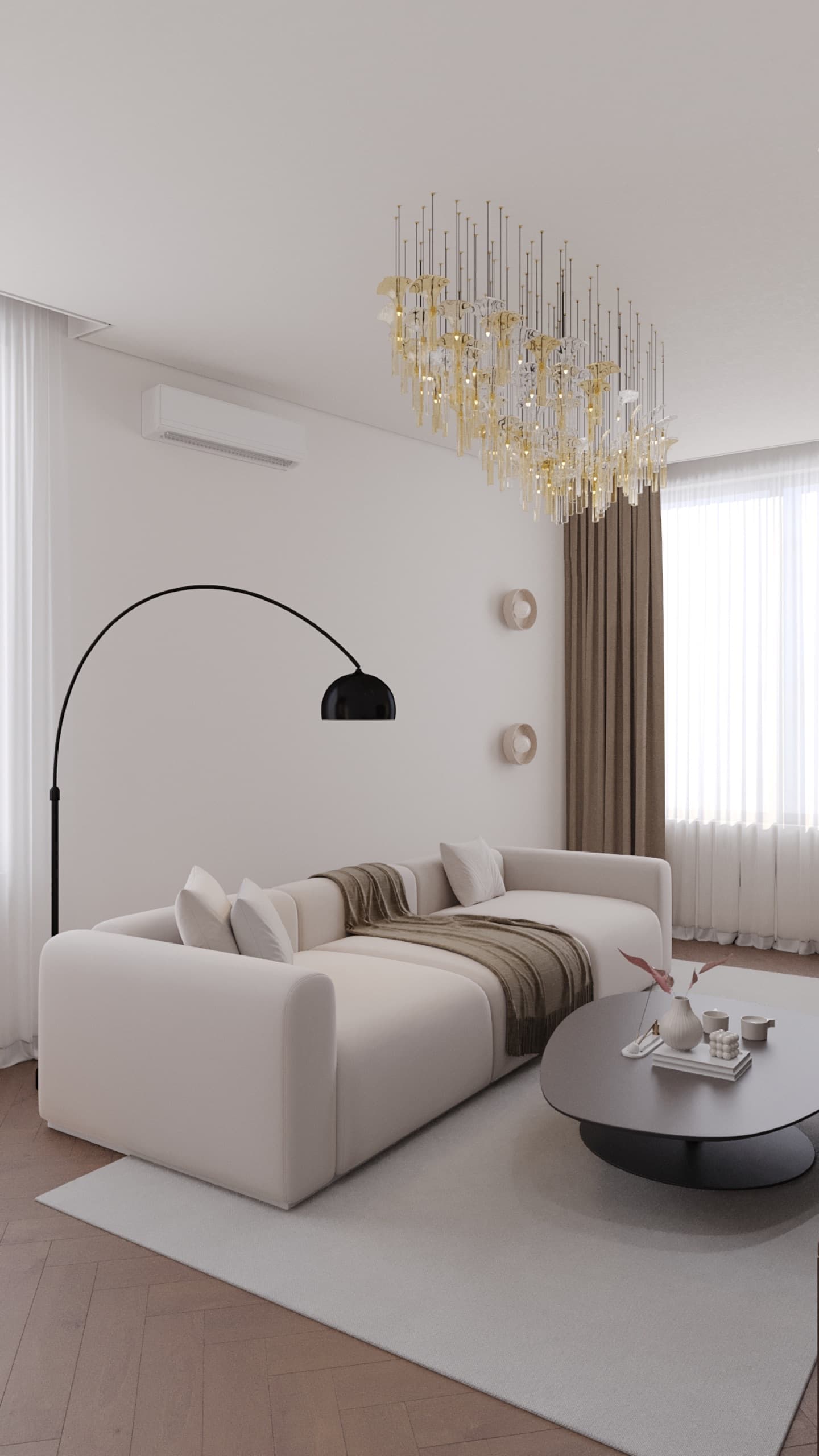
Another mistake is forgetting about furniture and light. A warm white that looks great with an oak floor can turn grayish next to cold steel and a white kitchen. In the 65 m² Mereke project, light walls work together with deep brown wood and soft diffused light — choosing paint separately from the other materials makes no sense.
Conclusion
Choose paint by three parameters — sheen, scrub resistance class and the right base for your color — and let the brand come fourth. Test on your own wall, do not skimp on preparation and tint in a single batch. If you are unsure about color, take our "What is your style" quiz or message us on WhatsApp — in a design project we select paint together with flooring, furniture and lighting.
READ ALSO
Wallpaper in a Modern Interior: an Accent, Not a Background — How to Choose and Where to Hang
Curtains and Textiles: a Guide to the Interior's Final Layer
How to Choose a Sofa: Size, Filling, Fabric — and Why Sitting on It Is Mandatory