April 18, 2026
Decor Without Chaos: the Rule of Three, Compositions and Emptiness as a Tool
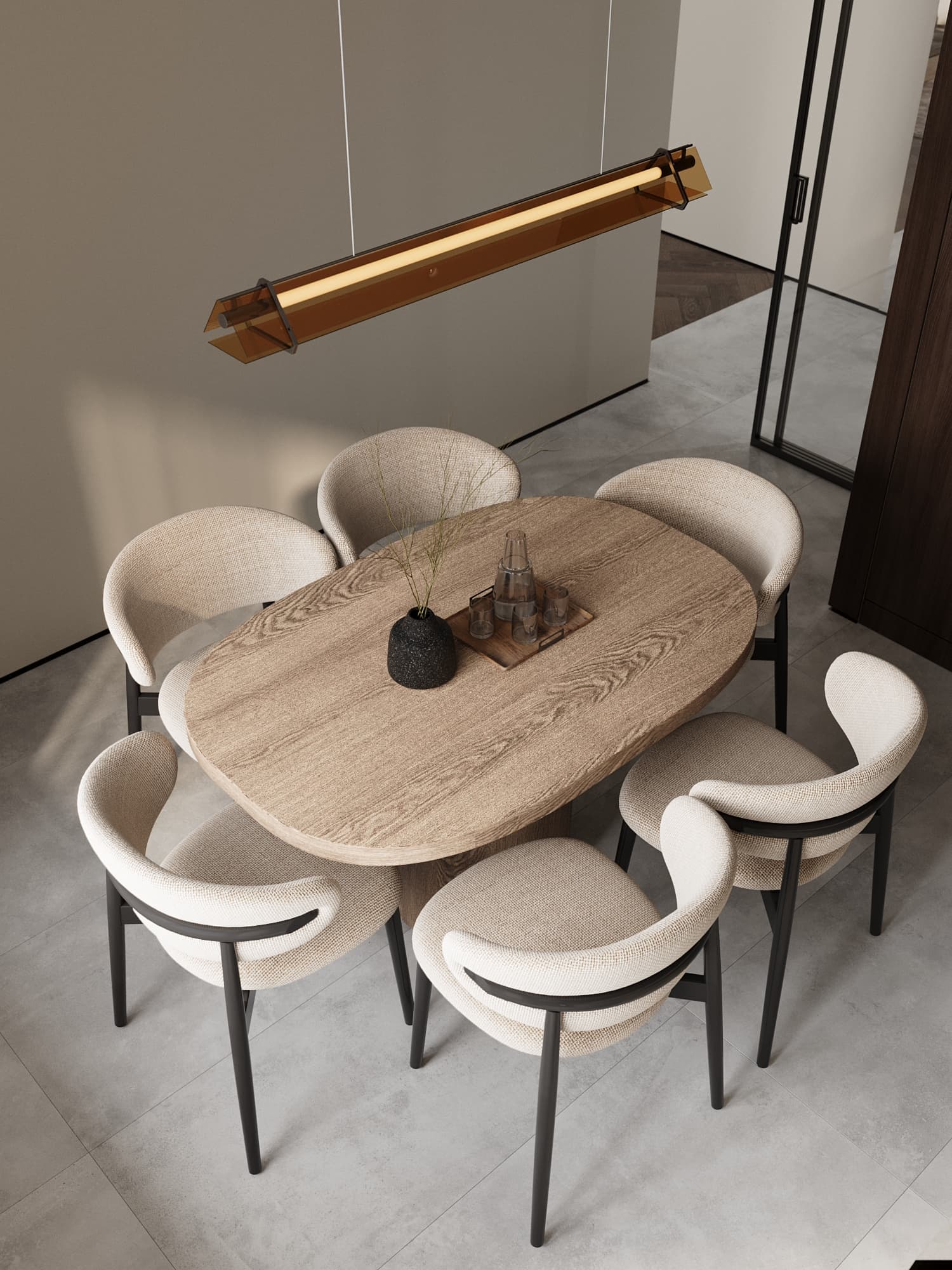
Decor is the final 5% of a project, yet it delivers half of the feeling that people actually live here. Those five percent carry a high risk: without composition rules, shelves turn into a souvenir exhibition and a sideboard into a storage spot for odds and ends. The good news is that stylists work with simple, repeatable techniques that anyone can learn.
In this article we share the rules we use when styling decor at the end of our projects: how to group objects, how big the art above a sofa should be, how many surfaces to leave empty, what to do with gifts and souvenirs, and how to refresh an interior without buying anything new.
Why decor turns into chaos
Chaos rarely comes from bad objects. It appears when there are many of them, in different scales, each standing alone. Every small item demands attention, and the eye has nowhere to rest. The second cause is randomness: things are placed where there happens to be space, not where they support a composition.
The third cause is decor with no link to the interior: a vase from one holiday, a figurine from another, a frame from colleagues. Each is nice; together they are noise. So start with an audit, not shopping: gather all your decor in one place, look at it as a whole and decide what truly matters to you.
The odd-number rule
Group objects in threes or fives. Pairs read as formal symmetry, which suits classic interiors: two lamps beside a bed, two vases on a mantel. On an open shelf or coffee table, though, a pair looks static, while an odd group feels alive because the eye has to move between objects.
A group must really be a group. Three objects spread across a sideboard are three separate spots. Place them close together with a slight overlap in depth, one a little forward and another a little back, so the composition reads as one whole.
A triangle of heights and a common thread
Each group needs a tall object (a vase with branches, a table lamp, a large frame), a medium one (a stack of books, a box, a ceramic bowl) and a low or flat one (a candle, a stone, a small plate). The silhouette forms a triangle and the eye travels along it. If everything is the same height, it looks like a fence.
Cohesion comes from color, material or theme, and one is enough: brass next to brass, matte ceramics with linen and wood, three shades of one color. Without anything in common, the group falls apart. Repeat the decor's color in textiles or in a painting nearby to tie the room together.
Scale: fewer but larger
The most common mistake is small decor on a large surface. Ten little figurines on a one-meter sideboard look like mess. Three large objects in the same spot look calm and expensive. The bigger the surface or wall, the larger the pieces on it should be.
Small items don't have to go; they get gathered. A tray unites candles, bottles and keys into one composition. A stack of books acts as a pedestal for a low object. Layers, such as a book under a vase or a plate under stones, make the arrangement look curated rather than accidental.
The wall above the sofa or bed
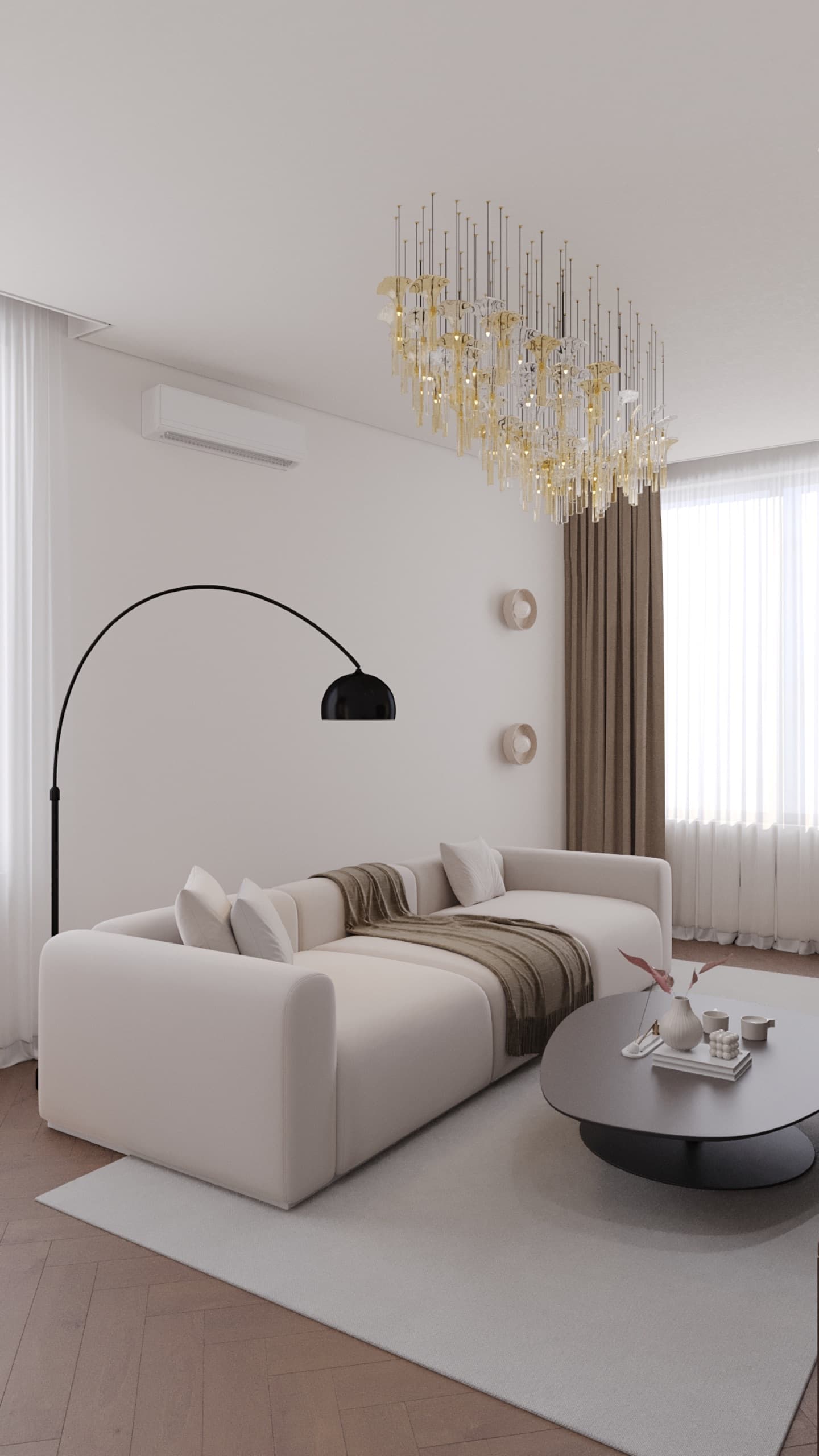
For art above a sofa, a good guideline is that the composition should be about two-thirds of the sofa's width, sometimes up to three-quarters. A 60 cm print above a 2.5 m sofa looks like a postage stamp. If you don't have one large piece, hang two or three frames with equal gaps and measure the group as a whole.
Height follows eye level: the center of a picture is usually placed around 145–152 cm from the floor. Above furniture, the gap matters more: leave roughly 15–25 cm between the sofa back or headboard and the bottom of the frame. If the rules conflict, for example with a high-backed sofa, the gap wins. Before drilling, tape paper templates to the wall and live with them for a couple of days.
Open shelves and bookcases
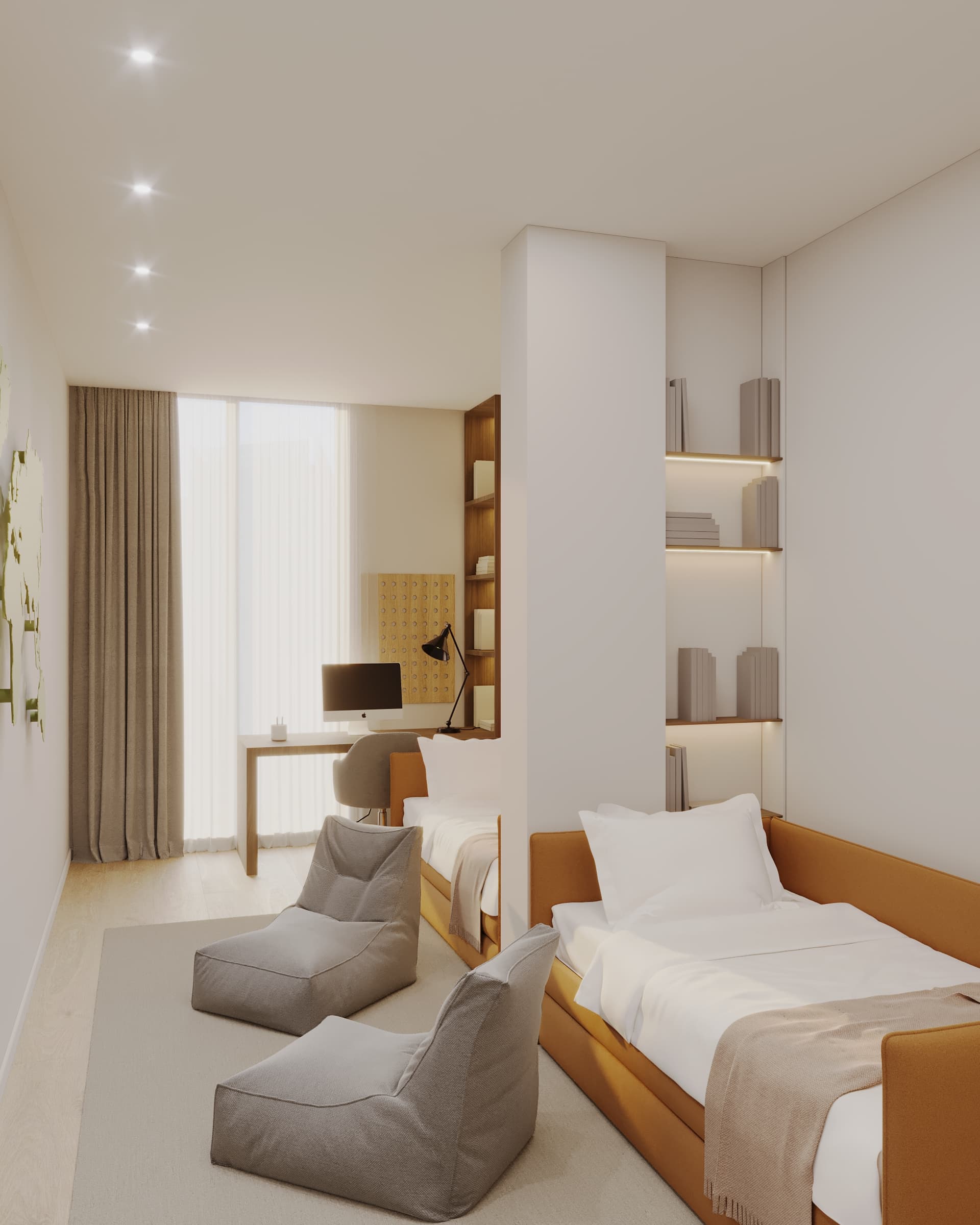
An open bookcase is the hardest place to style. Our working scheme: stand some books upright and stack others horizontally; spread decorative objects diagonally so similar accents don't line up; leave empty space on every shelf. Heavier, larger items go lower, lighter ones higher, so the unit looks stable.
A fully packed shelf reads as storage, not decor. Everyday things belong behind closed fronts, and open sections are for what you enjoy looking at. In the Arena City Life project we took exactly this route: main storage is hidden in handle-less wardrobes painted the wall color, so the little decor there stands out.
Emptiness as a tool
A good rule is to keep about a third of horizontal surfaces empty. That isn't unfinished; it's the air in which compositions breathe. An empty section of a sideboard, a blank wall between two groups, a shelf with a single vase give the eye a rest and highlight what stands nearby.
Empty space is also practical: it's easier to dust, and you can put down a bag, a cup or a book without moving the arrangement. Kitchen counters, the entrance and bedside tables should carry the least decor because they are used every day.
Seasonal rotation
You can own more decor than you display. Part of it lives in a box and changes with the season or your mood: heavy textiles, candles and dark ceramics in winter, branches and light vases in spring, linen and glass in summer. The interior feels new without purchases, and favorite things never become invisible.
It helps to plan a spot for this: one or two boxes on a top shelf or in a storeroom. When we design storage systems, we include that volume if the client likes to change decor.
Gifts, souvenirs and photos
The main filter: every visible object should please you personally. Decor for guests, or kept because it was a gift, turns a home into a showroom or a storeroom. Objects with a story can stay, but present them as a collection on one shelf or in a cabinet rather than scattering them across the apartment.
Photos follow the same logic: matching frames or frames in one color, a shared top or bottom line, black-and-white or consistent color editing. A dozen mismatched frames on the fridge and side tables create visual noise; a gallery on one corridor wall looks much calmer.
A checklist before adding a new object
Do I love it, or do I just feel bad throwing it away? What links it to this room: color, material or theme? Does its size suit the surface? Will at least a third of the surface stay free? Can it join other objects on a tray or in a group? If two answers are no, it belongs in the rotation box.
Summary
Calm decor rests on a few rules: odd groups, a triangle of heights, a common thread, generous scale, emptiness and rotation. Start with an audit and one zone, such as the living room sideboard, and you'll see the difference at once. If you want decor planned together with the layout, lighting and storage, fill in our project brief or message us on WhatsApp.