August 30, 2026
Colour in Interiors: How to Build a Palette for Your Apartment Without Missing
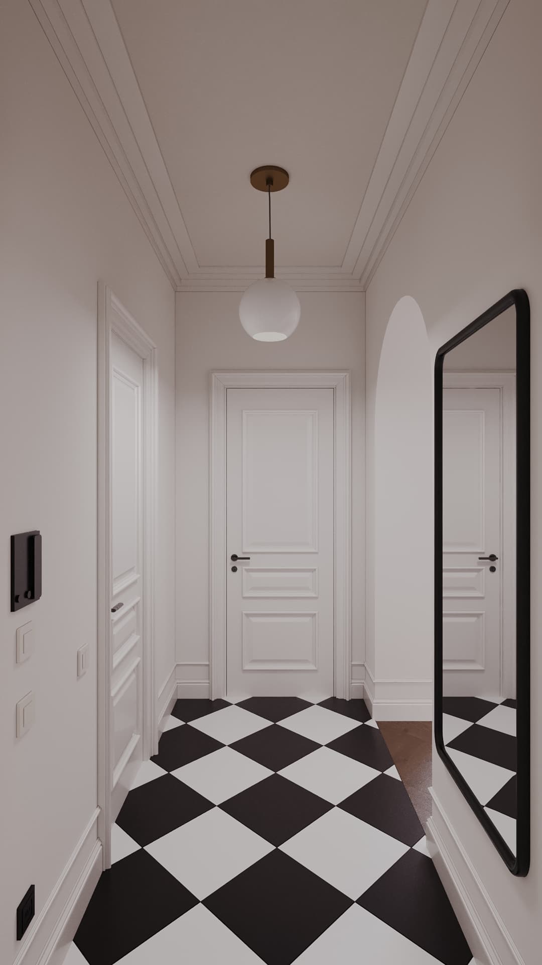
Colour is the cheapest and the riskiest tool in an interior: a can of paint costs little, but missing the tone turns a bedroom into a hospital and a living room into a cave. We explain how we build palettes in our projects, without complex theory, in practice.
The main idea: an apartment palette is not a set of favourite colours but a system. It has a base, a supporting colour and an accent, it ties rooms together and takes into account the light you actually have. Below is the step-by-step way to build and test it so you do not have to repaint.
Base, support, accent
The classic 60/30/10 proportion works: 60% is a calm base (walls, floor, ceiling, large furniture), 30% a supporting colour (curtains, armchairs, doors), 10% accents (decor, cushions, art, one bold object). It is not a law but a starting point, especially useful when you are only learning to build palettes.
The three layers read instantly and none argues with another. If a room has three equally strong colours, the eye does not know where to look and the interior feels noisy. If there is only one colour, it feels flat. Test yourself: photograph the room and turn the photo black and white. If contrast and hierarchy remain, the palette works.
Where to start choosing a palette
Start not with colour but with what cannot be changed: floor, large furniture, tile, the view from the window, kitchen fronts. Choose colours to suit them, not the other way round. Then define the mood of each room: calm (bedroom, study), energetic (kitchen, children’s room), formal (living and dining room).
Work with shade and undertone. All “whites” and “greys” divide into warm and cool: it is noticeable side by side, not on their own. So samples must be viewed together, next to the floor, curtains and furniture. A good rule for an apartment: one common undertone across rooms, while different moods come from brightness and saturation.
Why “that” colour looks different at home
Colour does not exist separately from light. North-facing windows give diffused cool light and make shades cooler and duller; south-facing ones make them warmer and brighter. So the same grey looks like two different colours in a north bedroom and a south living room. For north rooms take shades with a warm undertone; in south ones you can add cooler ones.
Artificial light changes colour too. Lamps around 2700 K are considered warm light, 4000 K neutral. Warm lamps “yellow” grey and bring beige to life, neutral ones show cool greys and whites better. For living rooms 2700–3000 K is chosen more often, and to avoid colour distortion it is worth taking lamps with a high colour rendering index (CRI around 90 or higher). The iron rule: look at the sample under the lamp that will permanently stand in the room.
Swatches: how to test colour
A swatch is a trial patch of paint on the wall. Make it at least A4 size, preferably two on different walls, and watch it in the morning, afternoon and evening under your light. If you paint the ceiling or floor, test them too: the ceiling colour changes the light in a room more than you think.
Place samples of floor, fabric and worktop next to the swatch. Do not judge colour from a small fan-deck chip: it deceives because it fills a fraction of a percent of your field of view. Paint is the only renovation material worth testing for three days.
Colour on a phone screen or in a catalogue is not final either: screens have their own colour rendering, and printed photos may differ from the original. Make the final decision only from physical samples.
Dark does not mean gloomy
Fear of dark walls is the most common: “the apartment will get smaller”. In fact a deep colour on one wall or in a separate zone (bathroom, bedroom, study) adds volume and a feeling of luxury, provided the light is layered. Dark often makes small spaces more striking than white: the boundaries dissolve.
In our Dauir project (38 m², Astana) one or two bold ideas, such as the burgundy bathroom, make a small apartment memorable. But such decisions need an exact layout and the right light, otherwise dark colour “eats” the room. Dark colour likes a matt surface and warm light sources at different levels.
Colour in different rooms
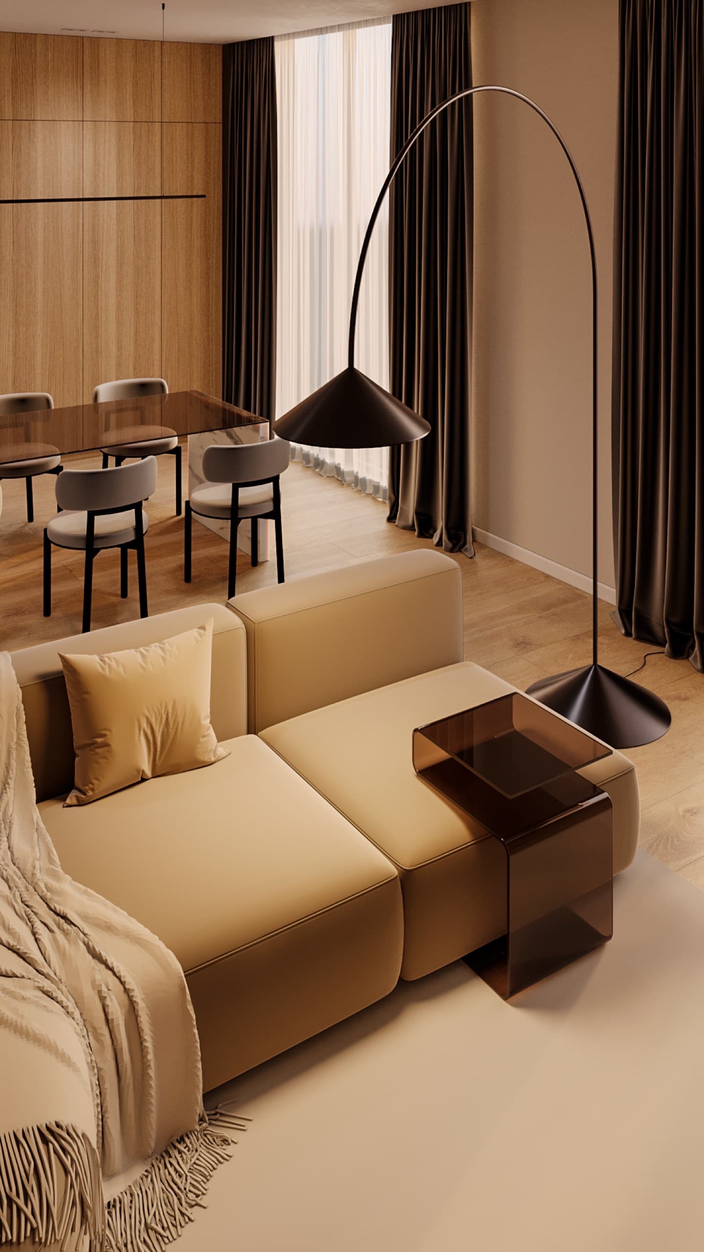
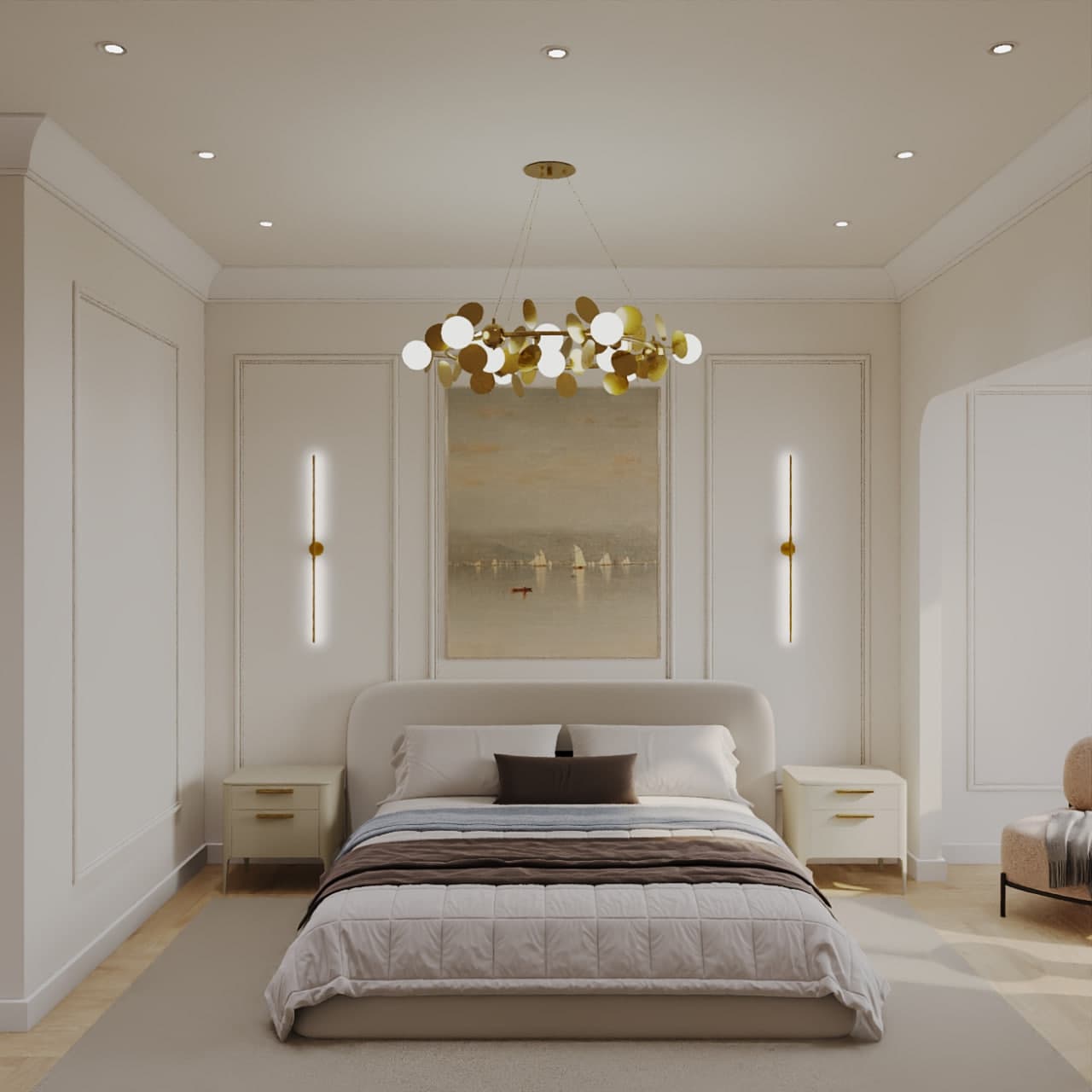
Bedroom: calm, muted, slightly warm tones. Deep earthy colours and soft textiles work well here. Living room: a neutral base and one or two expressive accents that can change with textiles. Kitchen: clean, light shades or one expressive colour on fronts, the rest neutral. Children’s room: a light base and bright objects that are easy to replace when the child grows up.
The bathroom and hallway are the best places for boldness: small area, short time spent there, a cheaper mistake. Deep green, graphite and burgundy are appropriate here. A corridor between rooms must tie the palette together: take a shade from the neighbouring rooms rather than invent a new one.
Colour and style
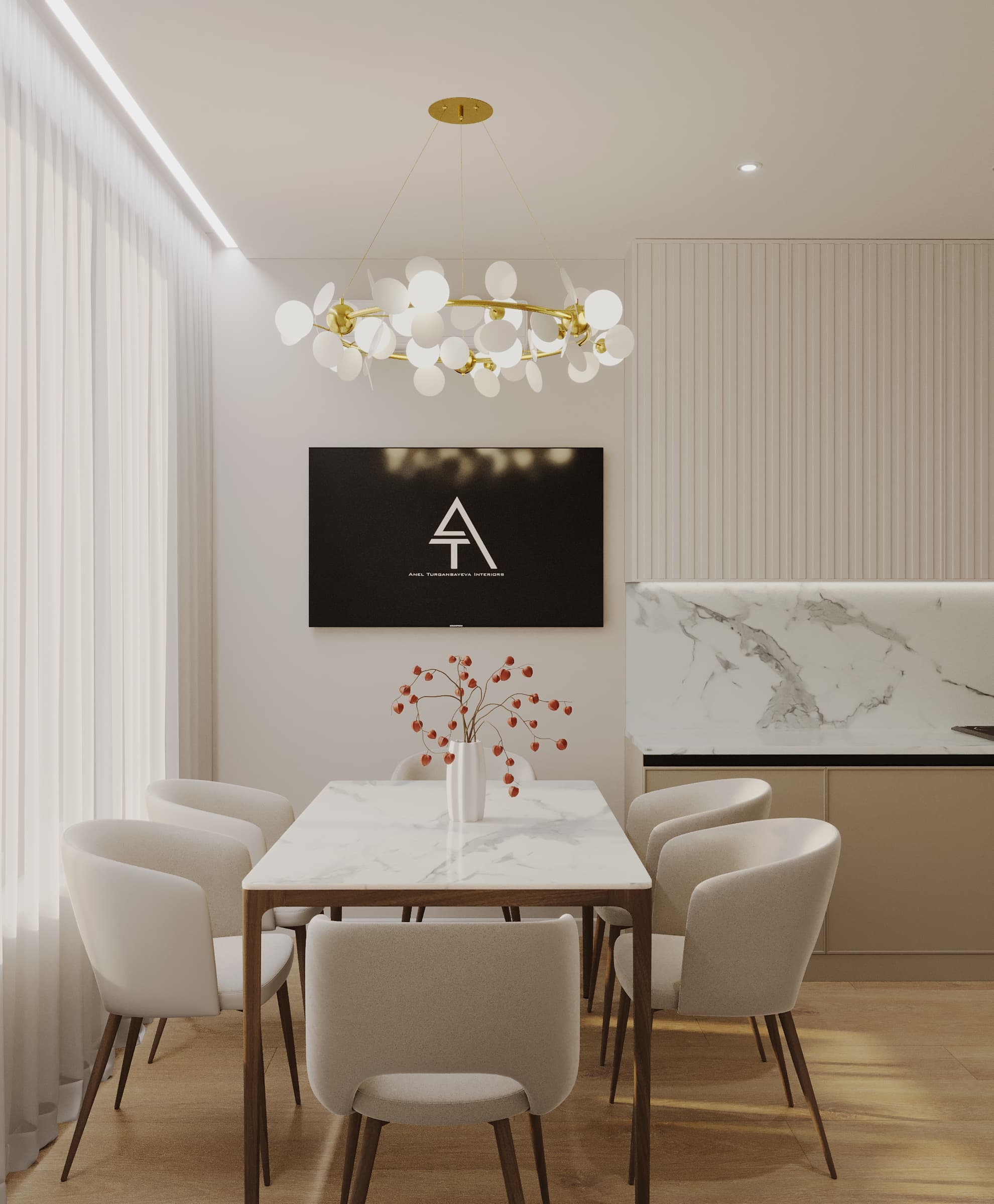
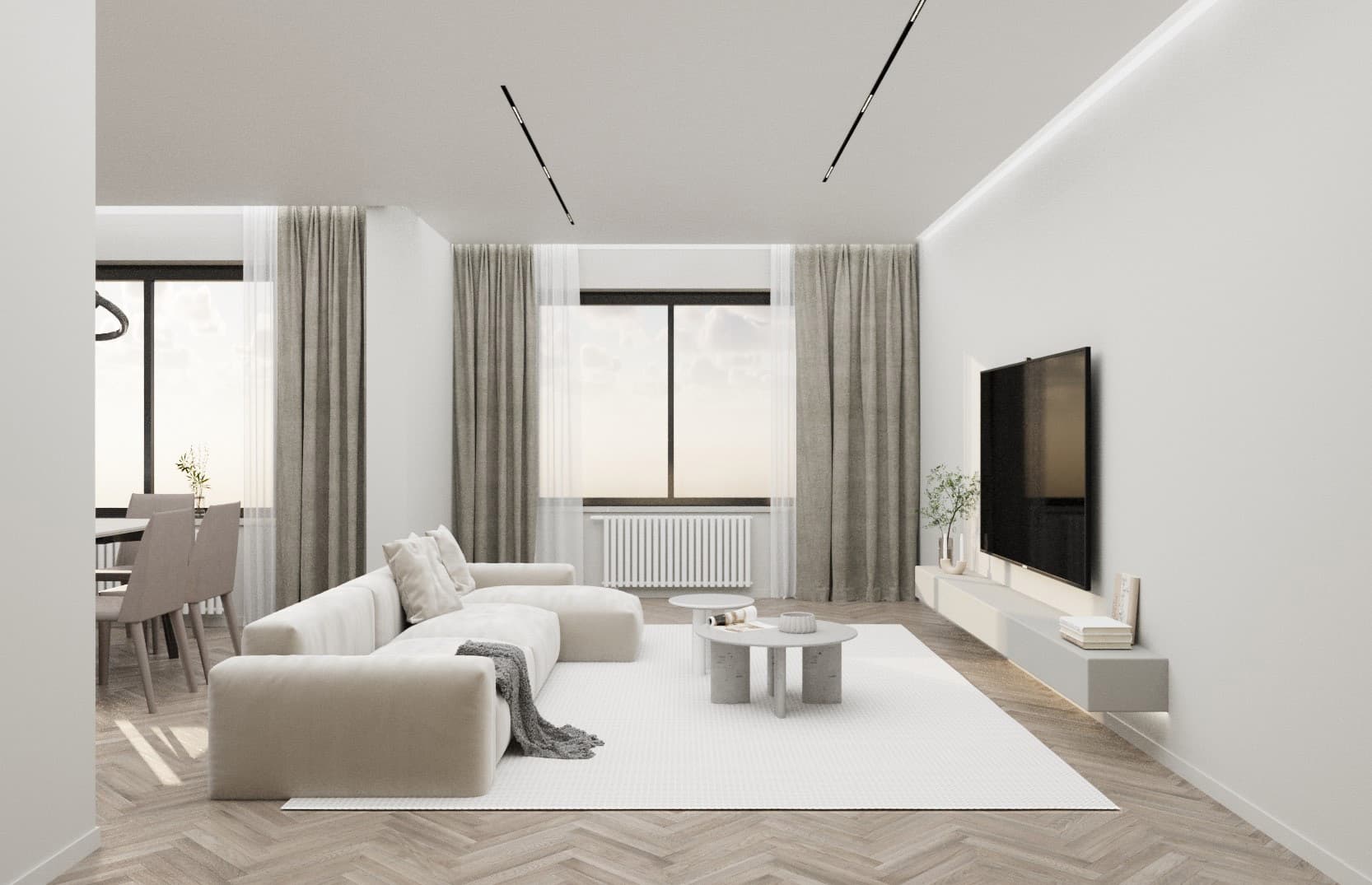
Style sets the palette. Minimalism works with a warm neutral base and one or two muted accents, as in our Mereke and Arena City Life projects. Neoclassicism likes soft warm white, milky and pastel tones with gold or brass. Mid-century, as in our projects in Almaty and Taldykorgan, uses wood and muted saturated colours: olive, mustard, terracotta.
In commercial spaces a palette works for recognisability and footfall. In the Heavenly restaurant concept in Singapore, for example, we used terracotta armchairs and blue bar stools against brass and marble. If you are not sure which style suits you, take the “What is your style” test on the site and look at the Style Guide.
Three mistakes we see constantly
Building a palette from someone else’s photos with no adjustment for your own light and area. Painting all walls the accent colour (“I liked it, let it be everywhere”): an accent works only while there is one. And choosing furniture and curtain colours from a phone screen: the final decision is only from physical samples.
In a design project the palette is built once and fully: swatches, fabric and material samples, a check under your lighting. If you want a palette for your apartment, fill in the brief on the site or message us on WhatsApp.