July 22, 2026
Interior Trends 2027: What Will Actually Take Root in Kazakhstan
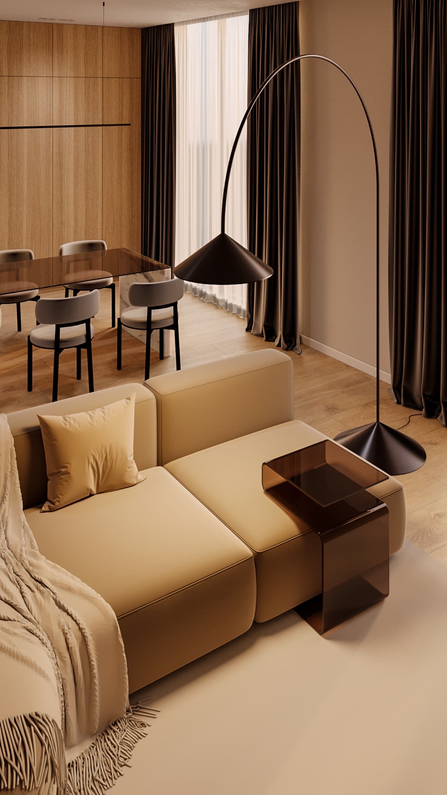
Every year trend lists promise a revolution, and then half of the "colours of the year" disappear from real projects. We look at trends pragmatically: an interior is built for 10–15 years, and only what outlives the headlines belongs in it. Below is what the 2026 fairs and the announced 2027 colours already show, our forecast of what will take root in apartments in Almaty and Astana, and what we advise avoiding.
A caveat up front: a trend is an observation, not a fact. We rely on what the major fairs actually showed and what paint makers officially announced. Everything else in this article is our forecast and design experience, and we present it as such.
Where trends come from and how we filter them
The main sources are trade fairs and colour forecasts. Salone del Mobile in Milan takes place every April and sets the tone for furniture and materials. Maison&Objet in Paris runs twice a year; its September 2026 edition was themed "Pulse in Motion", about movement, community and craft. The third source is the colours of the year from Pantone, WGSN with Coloro and the big paint brands.
A fair shows what manufacturers want to sell in the coming seasons. It reaches apartments in Kazakhstan later and in a simpler form. So we ask every trend three questions: does it solve an everyday problem; can it be replaced over a weekend if you tire of it; will it age along with a specific colour or shape? If the answer to two of them is "no", the trend goes into decor, not into walls and built-in furniture.
Colours of 2027: what has been announced
By autumn 2026 several brands had named their 2027 colours. In September Sherwin-Williams chose Celery, a soft green with a yellow undertone. Dulux named Soulful Sage, a light sage green, its Colour of the Year 2027. WGSN and Coloro announced Luminous Blue, a bright saturated blue, back in April 2025. Pantone usually reveals its pick in December; its 2026 colour was Cloud Dancer, a soft white.
Our observation: two major paint makers landed on the same direction, muted herbal greens. It continues a long-running interest in nature-based shades rather than marking a sharp turn. We see the WGSN blue more as a fashion accent for textiles and objects than as a wall colour.
How to use it: sage green works well on one bedroom wall, on lower kitchen fronts or in textiles. Many apartments in Almaty and Astana face north or look onto the next building; there, greens with a yellow undertone read warmer than grey-blues. Before painting, always test a sample of at least 50×50 cm on the wall and look at it in daylight and in the evening.
Warm minimalism: a trend that became the norm
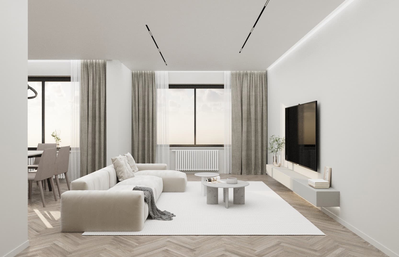
Cold white minimalism with gloss and chrome has almost left residential projects. Its place has been taken by a warm version: beige, cream, caramel, mocha, plenty of wood and textured fabrics. Our minimalist apartment concept is built on a warm caramel palette, smooth fronts and minimal decor. The completed 67 m² apartment in Arena City Life follows the same approach: a beige base, handle-less wardrobes in the wall colour, glass partitions.
We consider warm minimalism the safest choice for 2027 and beyond. It is not tied to a fashionable colour, ages well and changes mood easily through textiles, light and art. Just avoid "everything beige": you need one dark accent, such as deep-toned wood, dark stone or metal, as in the 65 m² apartment in Mereke.
Natural materials and visible texture
A notable theme at Salone del Mobile 2026 was materials that do not hide where they come from: travertine and limestone, wood with visible machining marks, matt natural finishes, fluted and striped textures. Against this background, glossy marble-effect porcelain with the same pattern on every tile looks dated.
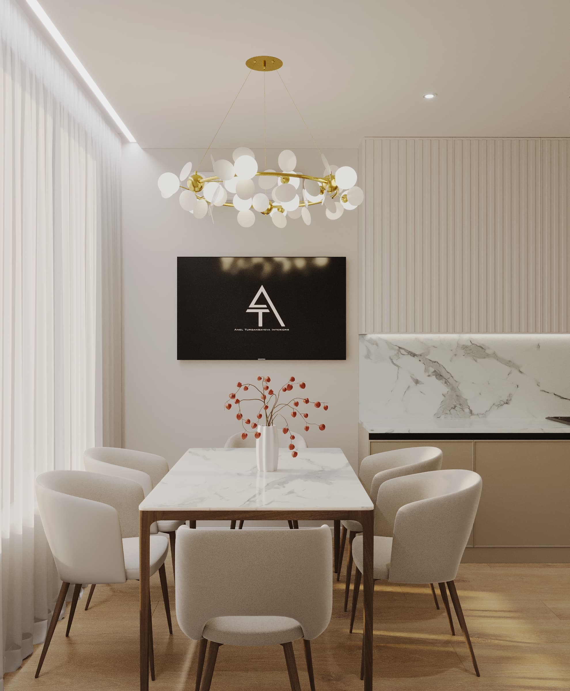
In the 100 m² apartment on Seifullin we used marble, fluted fronts and touches of brass, so the interior looks expensive because of materials, not decor. Our forecast: fluted fronts, veneer with expressive grain and stone with a living pattern will stay for a long time, because they are about surface quality, not colour.
A practical note: natural stone on a kitchen or hallway floor needs sealing and care; travertine is sensitive to acids. If the budget or lifestyle does not allow it, choose good matt porcelain with varied patterns in the batch. It gives a similar effect with no maintenance.
Earth tones have become richer
Another observation from the Milan fair reports: earth tones have not gone anywhere, but they have deepened into ochre, terracotta, apricot and warm chocolate. They are paired with dark base colours and bold accents. This suits the local context well: these shades echo the colours of the steppe and mountains and do not fight the strong sun.
How to bring them in safely: terracotta in an armchair or curtains, chocolate in veneer or leather, ochre in cushions and ceramics. In the 115 m² Bukhar Zhyrau Towers apartment this role is played by a burgundy dining table and marble with red veining against warm walnut. A saturated colour on every wall of a small room, by contrast, makes it darker and tighter.
Sculptural furniture and soft shapes
The dining table is no longer just a top on legs: at the 2026 fair brands showed tables with massive, sculptural bases that set the character of the whole room. Next to them were rounded sofas, curved lines, lacquered elements on upholstered furniture and reissued tubular chairs with modernist shapes.
Our forecast: rounded shapes will stay because they are practical in smaller apartments; there are no corners to bump into and the walkway feels freer. A very massive sculptural table, however, suits only a spacious dining room. In a 15–20 m² kitchen-living room an oval or round pedestal table is better: it looks current and saves space. That is exactly the kind of oval table in the dining area of the Arena City Life apartment.
Layered light and sculptural fixtures
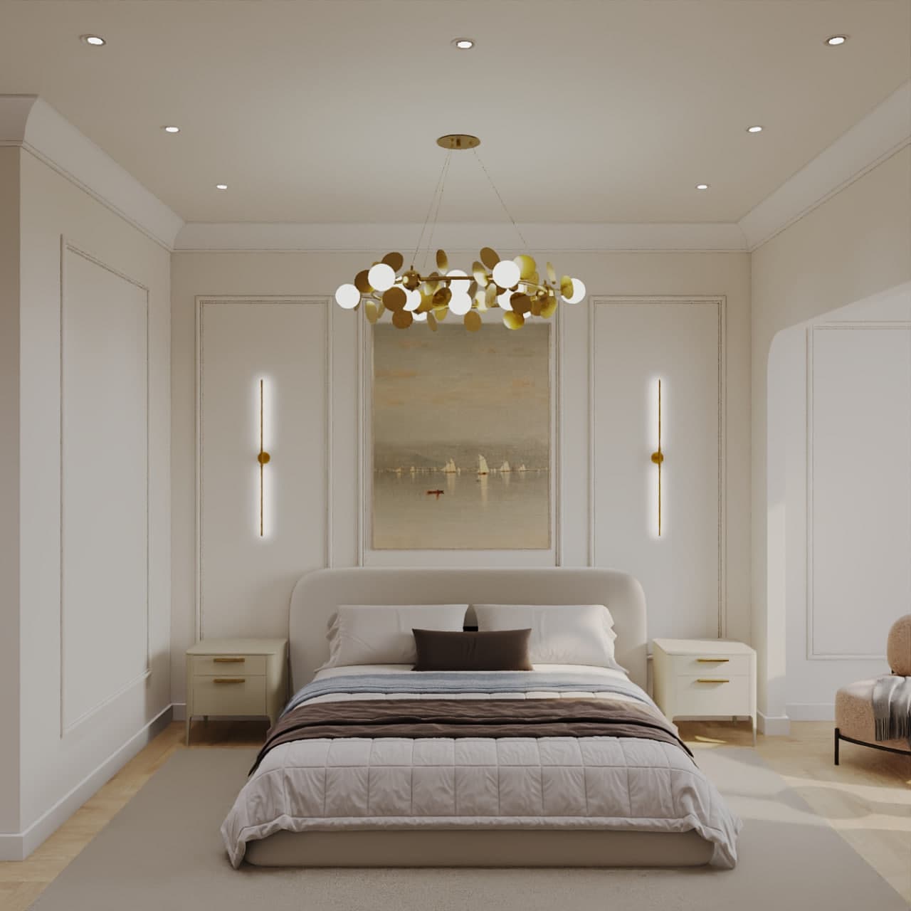
The light fixture has become an art object: cloud chandeliers, light branches, glass sculptures. At the same time, lighting is built in layers: general, zonal, accent and hidden. In the 65 m² Mereke apartment it is a cloud chandelier in the living room plus hidden lighting in niches and lines. In the 67 m² apartment in Besagash, track lights and cove lighting replace chandeliers, and the living room works in scenes.
In metals the move away from cold chrome continues: brass, bronze, champagne. Mixing metals is fine, but the rule is simple: no more than two per room, with one leading. Lighting scenes are planned at the electrical stage, so decide them before plastering, not after.
Concealed storage and invisible technology
Hardware manufacturers reviewing the 2026 fair point to demand for concealed doors, kitchen pantries and modular furniture that hides everything from appliances to sockets. Technology becomes invisible: built-in charging, hidden sockets, lighting inside cabinets.
This is a trend we recommend without reservation: it is about order, not fashion. A floor-to-ceiling wardrobe with fronts in the wall colour, a niche for the vacuum cleaner with a socket, a tall pantry next to the kitchen: all of this goes into the furniture and electrical drawings in advance. Changing it later is expensive.
Walls as decor
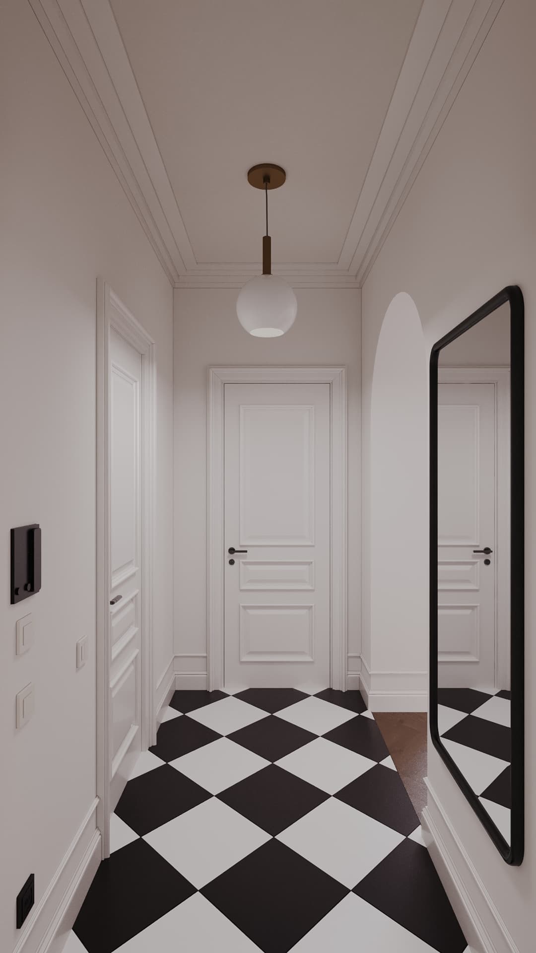
Another direction of the season is textured walls: wooden boiserie, relief tiles, mirrored panels, decorative laminates. We expect calmer versions to take root in homes: slats and veneer wall panels, textured decorative plaster, mouldings on straight walls, as in our 93 m² neoclassical apartment in Kamenka Park.
Bold three-dimensional coverings on an entire wall are more for cafés and hotels, where interiors are refreshed more often. At home, keep such an accent to one zone: the bed headboard, the TV wall or a hallway niche.
Checklist: lasting trend or one-season fashion
A lasting trend: solves a task (storage, light, comfort); is about material and quality rather than a specific colour; still looks good in your friends' photos five years later; works with different furniture.
One-season fashion: rests on a single colour or shape; is suddenly everywhere on social media; is expensive to remove; the interior works just as well without it.
Budget rule: put the main money into lasting decisions such as walls, floors, built-in furniture and lighting. Put fashion into things you can change without renovation: textiles, one painted wall, a light fixture, chairs, decor.
What we advise against
A total "colour of the year" across the whole apartment: you will tire of it in a season, so bring trendy shades in through decor and one wall. Complex multi-level ceilings with coloured lighting: greetings from the 2010s. Glossy kitchen fronts with chrome handles. Expensive tiles with a loud fashionable pattern across the whole bathroom: you cannot repaint them.
Most importantly, do not copy trends blindly without adjusting them to your life. A white boucle sofa in a family with a dog and children, open kitchen shelves without a cooker hood, travertine in the hallway with Astana's snowy winters and de-icing chemicals outside. A trend is the spice; the dish is your daily life.
Conclusion
The 2027 trends we consider lasting are a warm base, natural textures, concealed storage and well-planned light. Fashionable colours such as sage green, richer earth tones and sculptural shapes are great accents if used in moderation. Want an interior that will not age by the next trend list? Fill in the project brief or take the "What is your style" quiz, and we will plan solutions for a decade. You can also message us on WhatsApp with any questions.